
Modular logo in action, highlighting the many ways people may ask to help.
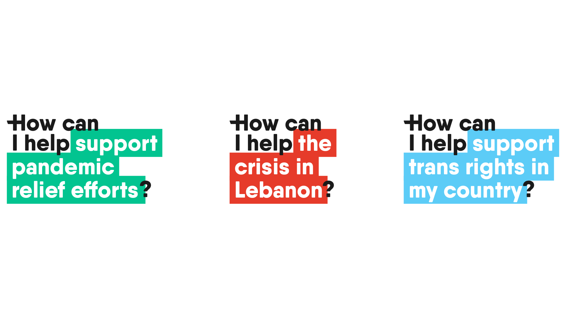
The modular identity allowed us to rapidly respond to new world situations.

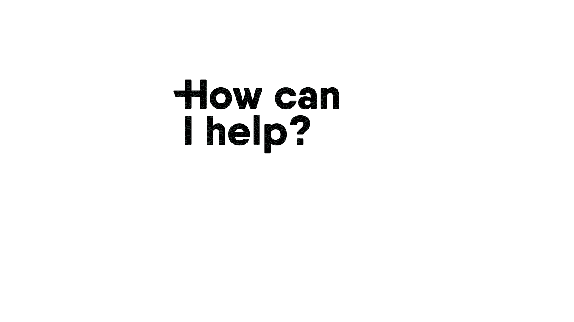
Operational at any size, the logo is recognisable as our plus / H hybrid, monogram, or full text.

Qantelas Soft extrabold was chosen as typeface as it is clear, legible and ownable in the space. It has rounded corners for a softer, more approachable feel, with a strength in it’s thick weight.

Photography is human and relatable. Highlighting genuine human interaction to build empathy and trust.

The website was intentionally paired back, allowing the functionality to come forward without being obscured by brand.

In advertising and core communications, the photography and brand can lead.

Social channels